
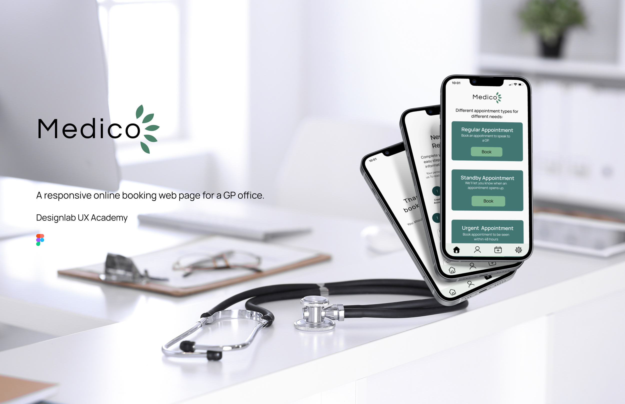
Medico is a GP practice with different locations.
Medico relies on online booking for their patients to make appointments with their GP.
Medico’s values include accessibility, convenience, empathy and care.


User Problems and Proposed Solutions

Users need an accessible and easy to use online portal for booking appointments.
Many online booking platforms for medical centres are not user friendly.
Medico is researched and designed to maximize convenience and support users to keep engaged with their doctor.

Process

Research Goals


Competitive Analysis


User Interviews
5 people between the ages of 22 and 57 participated in user interviews where they were asked questions around their experiences, pain points and positive notes from other online systems.
All users noted they were comfortable using technology.
Due to time constraints, no users over the age of 57 were interviewed.
To see interview questions click here


User Personas
User personas have been developed to show that users have busy and diverse lifestyles, and need a GP practice and online booking service that reflects that.

“ I have type two diabetes and check in with my doctor regularly, I need a booking system which is easy to use and reliable.” - Dan

“ I have a busy job, and a lot of commitments outside of work. When I need to see my doctor, I want to be able to book and quickly and easily as possible.” - Jasmine
Users value an online booking system which is convenient and easy to use, and allows them to book appointments without fuss or interruption to their daily lives.
Storyboard


Research showed users liked having a calendar feature for appointment booking.
Pages must be organized and easy to navigate.
A progress bar so users can see where they are in the registration and booking process.
Different types of appointments to accommodate different needs of users.
Features Needed


Sitemap

User Flow


Low Fidelity Sketches
Low fidelity sketches were done to explore different design ideas and work out any issues with the design early in the process.


Brand Identity
Brand values: Care, Convenience, Accessibility, Empathy, Health, Compassion.
Medico’s branding was created with these values in mind. The colours, icons and logo was chosen to create feelings of simplicity, cleanliness and security. Users are meant to feel calm while using Medico’s site.
All colours have also been checked for accessibility.
Mood Board

UI Set
Colours


Typeface

Desktop

Mobile
Logos

Medico’s logo was designed to have the shape of leaves. This was to give the site an earthy and healthy feel.

Mid fidelity wireframes were created to come up with a basic design and get feedback early in the process.
Progress bars on both the registration and the appointment booking pages.
Both have 3 different sections, the registration on one page, while appointment booking divided into 3 pages.
Appointment booking includes a space for users to communicate why they need the appointment. There is also a space for users to upload a photo.
Navigation bar at the bottom of the screen for easy access.


Responsive Design
Mid fidelity wireframes for desktop were also designed to reflect responsive design for different devices a user may use.


Usability tests were conducted with mid fidelity wireframes to see how effective the site was in being a convenient way for users to book appointments. This was an opportunity to get user feedback on booking an appointment and registration processes as well as the overall branding of the site.
Users were given the tasks of registration and booking a regular appointment.
5 users were given the tasks of booking a regular appointment and registration as a new patient.
Some users were interviewed, others were new to the research process.


Task Flows
Usability Test Findings


Feedback Grid

High Fidelity Prototypes
Mid fidelity prototypes were iterated based off user feedback from usability tests.
Changes included adding a “home’ button on the confirmation pages, having a place where users can easily access the privacy policy and clarification that users must sign in to book.

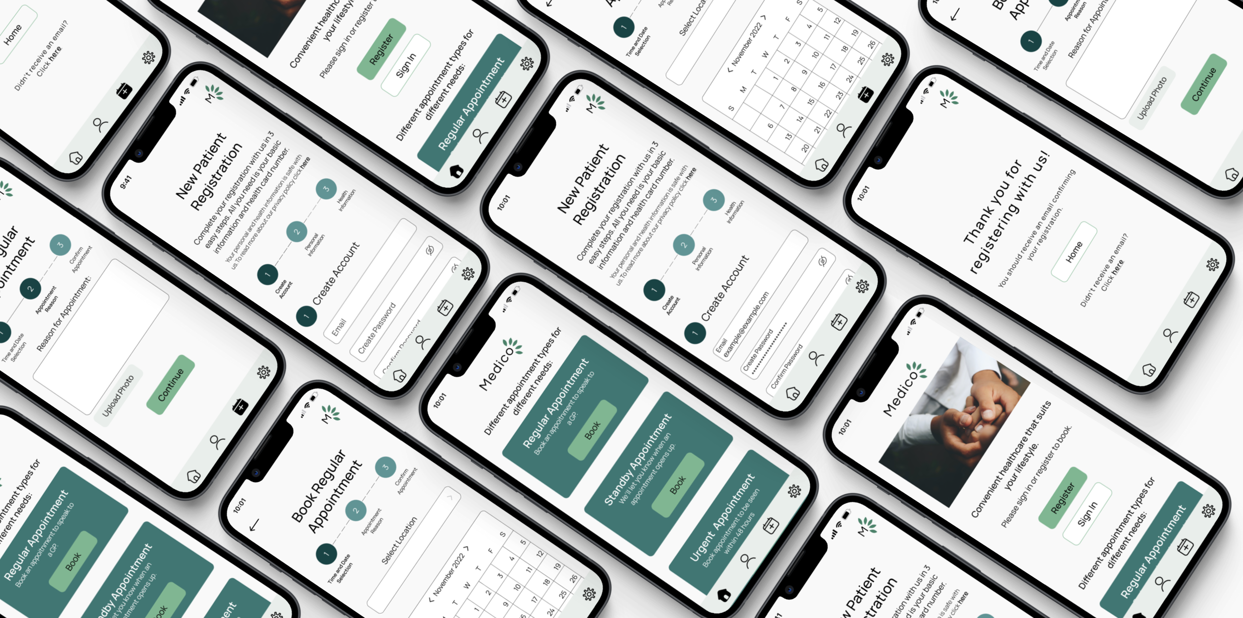
Patient Registration
Patient registration has been broken down into 3 sections- create an account, personal information, and health information.
Progress bar ‘fills out’ as user goes along in the process.
Information users will need is listed at the start so users can be ready to register.

Regular Appointment Booking

3 steps to booking, broken down by a progress bar which allows users to see where they are.
Drop down which allows users to pick a location, and a calendar to easily select a date.

Summary
Research showed users liked online booking systems, and wanted a reliable and convenient way to book appointments.
Usability tests showed users made little errors while completing tasks, and had very positive feedback about Medico’s branding and overall site structure.
Research questions from the user interviews could have gone more in depth to help develop a stronger understanding of what users need.
Due to time constraints, no users over the age of 57 were interviewed. All users who were interviewed stated they felt comfortable with using technology. Receiving feedback from users less confident with technology would have been very useful to develop Medico to be as convenient as possible for a variety of users.

Next Case Study: City of Toronto