


A responsive website for a registered social work practice.


A meeting was set up between myself and Lindsay to discuss her wants and needs with her website.

Analysis of Lindsay’s current website and a competitive analysis.

Tests were conducted to see how users interacted and felt while using the site.

Low, mid and high fidelity responsive wireframes as well new icons and logo.

Feedback from client and usability testing was used to iterate on the site.

I met with Lindsay to discuss who her users are and how she wants users to experience using her site.
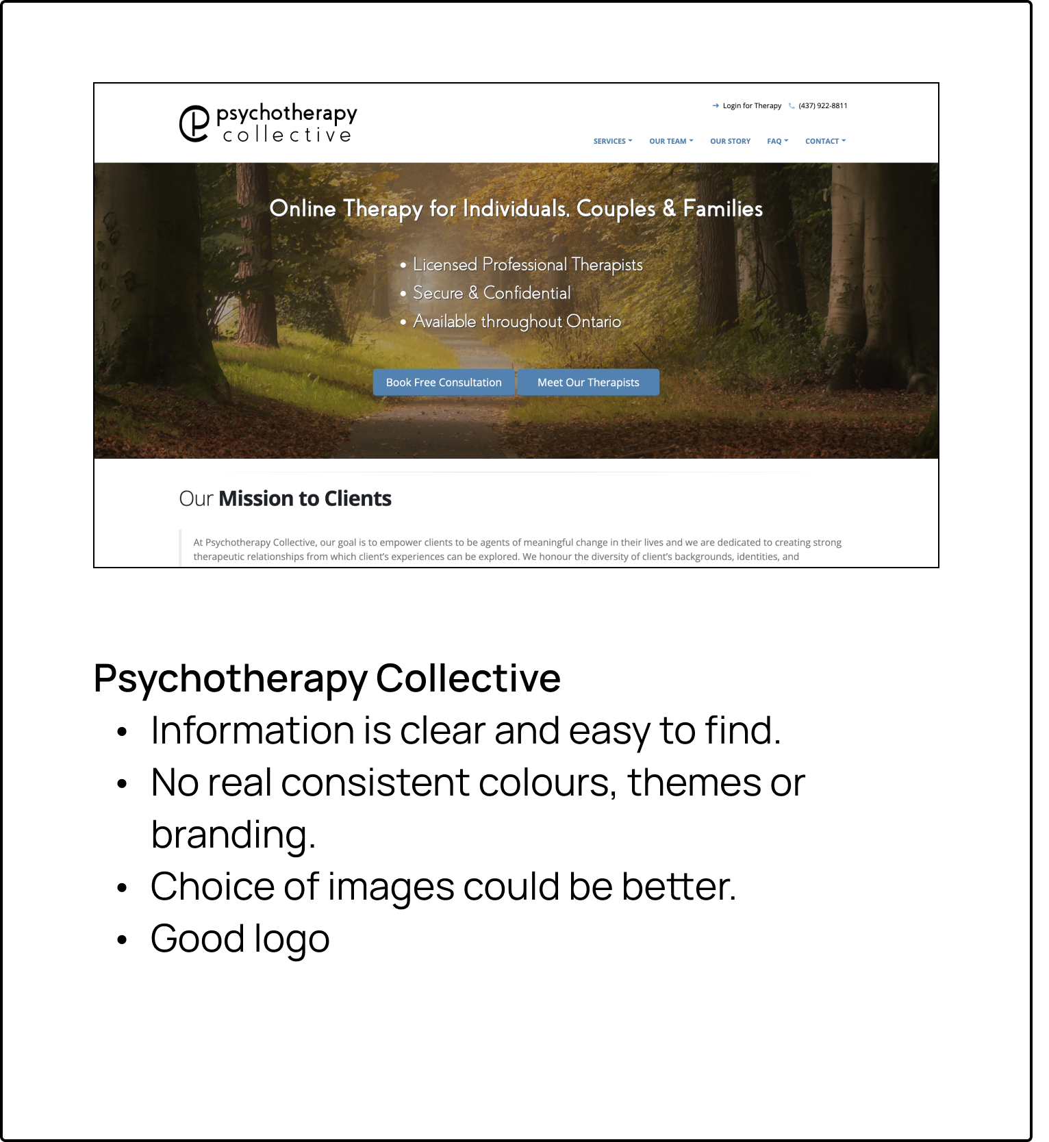
Current website

Lindsay pointed out some pain points in her current site, and what she would like to change.
She noted that she wanted to change her colour palette’ logo and improve her overall UI.

Lindsay wants a website that represents her values.
She wants a logo that incorporates a tree or roots.
Lindsay wants her typography and images updated. She wants images to be mostly positive- to show the potential positive impacts of therapy.
The overall goal of the website is to give users all the information they might need and get in contact with Lindsay for a consultation.


Current website analysis


Competitive Analysis


Personas


Sitemap


Mid Fidelity Wireframes


With Feedback from Lindsay, high fidelity prototypes were iterated and colour was added, in addition to the logo.
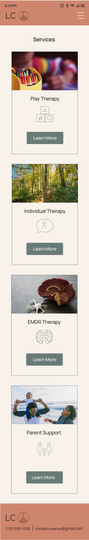
Mobile pages


Desktop


Usability testing was done with 5 users to explore and understand how users interact with the site, and if Lindsay’s branding creates the emotions she wants.
Usability Test Findings


Feedback from usability tests and from Lindsay led to final iterations of the website for both desktop and mobile.

User feedback showed that Lindsay’s website now represents her brand in a better way.
The website now has a more clean and professional look, with more visual design elements to add to the user experience.
Challenge: Lindsay has a subscription to the website builder, Wix. This website has to be designed based off of templates available with Wix.


